 Tweet
Tweet
That's awful. They changed equipment suppliers and there's a fucking street party? I hated adidas and all that too but chrissakes already...
-
-
It was probably intended for the students, and not old farts like you anyway ... :-P"What you're doing, speaks so loudly, that I can't hear what you are saying"Comment
-
Heh. Retailers always say you have to lock in brand loyalty at an early age...Comment
-
I perused MDen online this morning and nothing really jumped out at me where I thought "Oh, I need one of those!". All that needed to be done was fix the maize and that was accomplished last year. If anyone knows of an Adidas clearance sale let me know. Also, the Jumpman logo is too big.Comment
-
It's nice to see the Nike/ Jumpman logos associated with Michigan now, but yes.... nothing that nice to purchase.
It's too "Walmart" for me.
I'm excited about the official uniforms reveal though.AAL 2023 - Alim McNeillComment
-
These aren't going to be my favorite versions of the uniform, certainly, but they aren't anything to get worked up about.
I'm looking forward to/dreading seeing the basketball uniforms. That's where the biggest difference will be.Comment
-
Aren't they putting more stuff out at the BBQ?F#*K OHIO!!!
You're not only an amazingly beautiful man, but you're the greatest football mind to ever exist. <-- Jeffy Shittypants actually posted this. I knew he was in love with me.Comment
-
Comment
-
The unis are fine. I wouldn't say that they're "outstanding" or anything. They're just good.
What matters most is the guy wearing the uniform.
Prepare to play and win."What you're doing, speaks so loudly, that I can't hear what you are saying"Comment
-
I don't like the Jumpman emblem being so prominent. Would prefer a swoosh if it has to be branded."The problem with quotes on the Internet is that it is sometimes hard to verify their authenticity." -Abraham LincolnComment
-
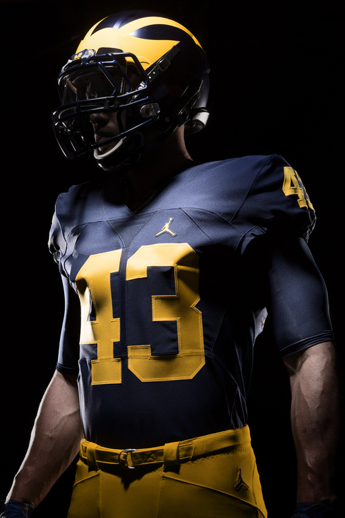
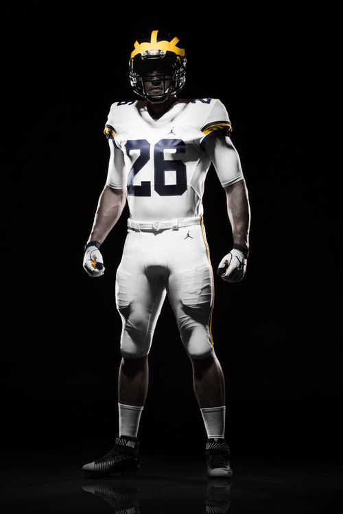
Harbaugh says the white pants on the road will be a permanent thing. He's a fan of that. And so im I, like the details of the arm/shoulder stripes. I love that the color and width match the maize stripe on the helmet. Great little touch there. No weird piping...no swatches of maize anywhere. Simple and clean. I suspect the same maize stripe matches on the pants as well. The numbers have changed (see above pic). The 2, 4, and 5 stand out to me as being notably different from the previous font.
Home: jerseys have remained unchanged, as well they should.
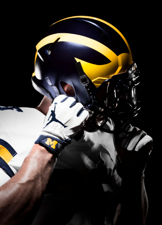
Helmet: that's a matte finish. Not as matte-ey as the matte used in the Outback Bowl a few years ago, but it's close. We'll need the light of day to make a good judgement on that one. Word is, those will be the helmets used this year.Comment
-
Verdict on the jerseys, everyone?
The late mid to late 90's home were nearly perfection, clean and classy. That version of maize was my preferred, more yellow than the 70's but not the highlighter we've seen lately...
I LOVE that were uniquely the only Jumpman football school (for now), hopefully that's a distinction that only one or two programs at most in a conference. Overall, I give them an A- well above anything Adidas attempted. Hopefully the 'font' grows on me though seeing live or in TV might change my opinion. For the most part, Nike played it safe by not messing up an already great, classic jersey...
Away jerseys? I much prefer maize pants, they look much nicer with the white jersey. Way too much white and not enough maize. The away jersey (top) is pretty good relative to our past ones. Again, need more maize somewhere, just a small outline around the letters?
I'm guessing we'll see a couple alternates for a game (or 2) this season. Nike needs their investment to pay off so we'll see alternates for sure that people will buy. The potential alternates has been my larger concern than the home, away jerseys.Comment
-
Comment
-
They're perfect. Especially with the gloves and cleats. The all white roadies are my favorite unis of all time and I love that they're sticking around.Comment
-
They're not Nike, so a swoosh wouldn't make any sense.Originally posted by AlabamAlum View PostComment
Comment